DTS:X Ultra Windows Reference App (2017)
DTS licenses multiple audio enhancement technologies to Windows PC manufacturers so that consumers can enjoy high quality immersive audio experiences over headphones and with the built-in speakers. To help simplify the technology integration effort, as well as hopefully inspire our partners, DTS creates "reference" apps for managing advanced DTS audio settings which manufacturers are free to integrate as-is, modify, or ignore completely and do their own thing.
With this project, the Product Management leadership asked us to design an app with "sizzle." Something that would excite gamers on higher end PCs. And they gave us permission to break away from the past, such as the design of our mass market DTS Sound product.
The graphic designer working with me on this project and I both spent about a week reviewing gaming and futuristic app designs and concepts. We both spent a lot of time on Dribbble tapping into the design zeitgeist, as well as browsing Behance, YouTube, and others. Then we spent another week working on a large number of design concepts.
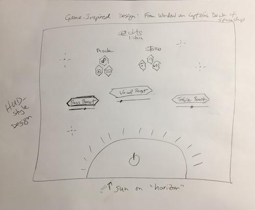
One day, I had a great concept for a design: Imagine standing on the control deck of a spaceship. The sun is cresting the bottom of the ship's viewport, with a futuristic heads up display ("HUD.") showing multiple controls. I drew a sketch (see below) and passed it to the graphic designer to execute as a screen mockup. We would be giving a presentation of our design sketches soon and I figured this concept might make the final cut. Ultimately, this design was chosen and executed, though it needed a few iterations refining the concept and adjusting for technical requirements and capabilities.
My Role: Lead UX designer. I originated the selected design concept. The graphic designer executed the high resolution screen mockups shared here. Additional UX deliverables available for discussion upon request.
HUD Design Concept Sketch
When the concept came to me, I grabbed a pencil and piece of paper, and sketched out a single screen. The talented graphic designer I worked with was able to make sense of it and create a beautiful screen mockup. This design direction was ultimately selected by Product Management.
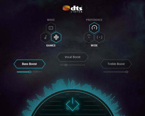
HUD Design Concept: Round 1 Screen Mockup
The graphic designer created this screen mockup based on my sketch.
Rather than the typical "DTS Orange." brand color used in most other products, we went with a shade of teal that was in the brand's secondary color palette for a more futuristic look.
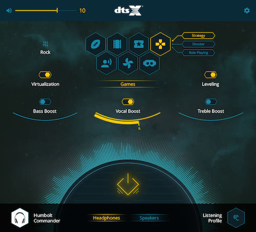
HUD Design Concept: Round 2 Screen Mockup
As the project progressed and more information become available about the features supported by the DTS audio technology, we iterated on the design. In this project, I wanted to keep more of the features on the Main Screen rather than pushing them off onto secondary screens wherever possible.
Considering the futuristic design, we had grand plans for micro animations and a multi-dimensional parallax background. Unfortunately, due to engineering constraints, these extra features were cut.
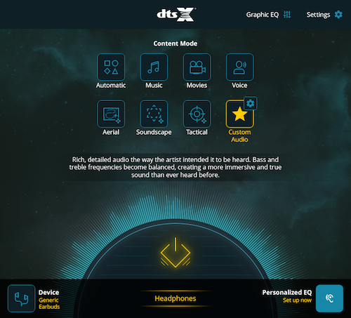
Final Production Design: Screen Mockup
This was the final plan of record design. Unfortunately, this version didn't have futuristic hexagon-shaped buttons nor an animated sun, but it was much simpler and more approachable to users, including a text description about the benefits of the currently selected Content Mode. It also featured a modular design such that certain features could be hidden based on the PC manufacturer's licence without affecting the layout. We did make a few more modest tweaks.
At the request of Product Management, we ran two user studies on this design versus the competition. We surveyed users and asked them to compare this design against designs from a certain industry heavyweight and a spry startup that was enjoying some popularity among gamers. I'm proud to say that this design beat or matched the competition on all metrics.
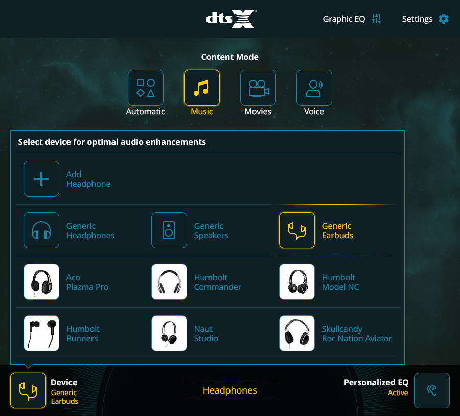
Listening Device Selection Flyout: Screen Mockup
One of the cool things about the DTS audio enhancement technologies is the extra fidelity that can be achieved if the PC knows what kind of headphones the user is currently using. DTS takes acoustic measurements of many popular headphone models for a growing tuning database.
When the user selects the "Device" button in the bottom left-hand corner, she sees the list of supported listening devices. This screen mockup features some of the faux brands and generic headphone photos we licensed for specific use in design concepting to avoid alienating any of our headphone partners.
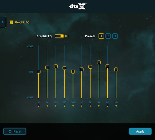
Graphic Equalizer: Screen Mockup
The GEQ design is pretty straightforward with support for 3 user-defined presets, 10 frequency bands, and 12 dB plus/minus range.
DTS has mixed feelings on GEQs. Studies show that regular people generally don't know how to use GEQs very well, excepting audiophiles. Instead, DTS works with device manufacturers to tune the speakers and headphone settings so well that most people won't be tempted to muck around with the GEQ. This is one reason why the GEQ is de-emphasized in DTS audio app designs vis-à-vis much of the competition.
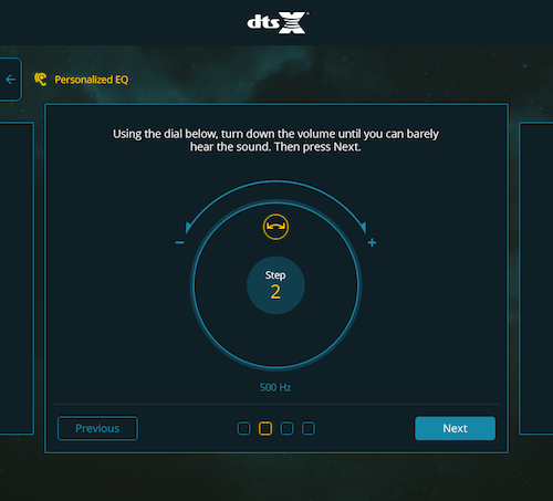
Listening Profile: Screen Mockup
As seen in other DTS audio app case studies in my portfolio, the 2017 Windows PC app also featured support for the DTS Listening Profile feature. This is an optional audio enhancement feature that PC manufacturers can choose to license, and only works with headphones.
After the user completes a five-step hearing assessment, the DTS audio technology can automatically tune live audio so that it fits better within the user's estimated hearing range. Users experience clearer spoken dialog and a more dynamic acoustic range.
This particular feature offers multiple UX challenges... Please ask me about them. ☺
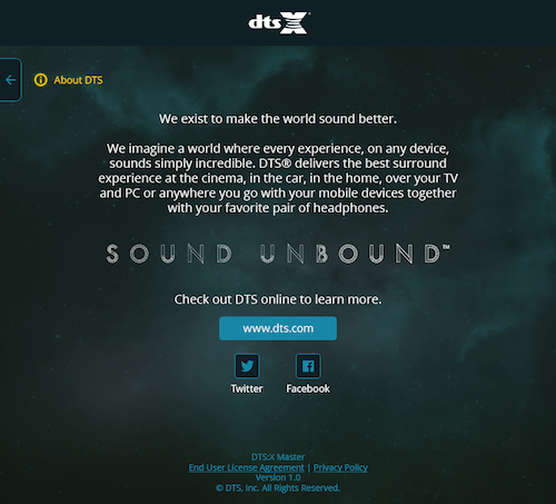
About Screen: Screen Mockup
Throughout my time at DTS, I worked hard to raise design standards and bring consistency to products across brands, product lines, and internal political divisions. One of the little projects I worked on was standardizing the About Screen.
I worked closely with representatives from Marketing, Legal, and Product Management to create a general template that could be adapted based on the needs of both B2B and B2C products, as well as products in different markets.
This screen shows the contents of the About Screen for a DTS-branded product, B2C, with social links, in U.S. and European markets. It features standardized means for accessing a EULA and Legal Notices, e.g., as might be required by open source licenses. It also has a consistent copyright statement and version info for product support. I required that every product supported by the UX team offer an About Screen.
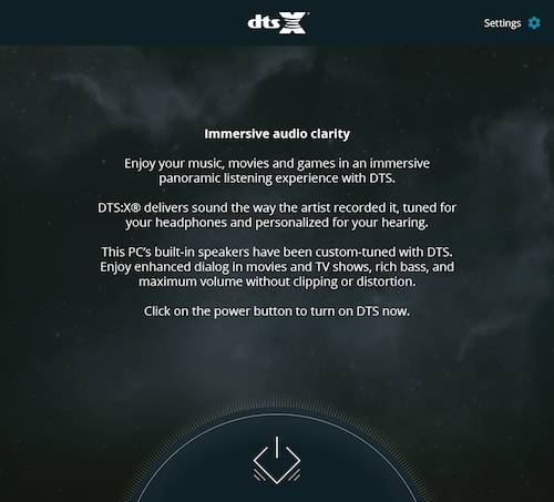
DTS Off State: Screen Mockup
The user could optionally turn off the DTS audio processing enhancements at any time, of course. For this and other DTS audio products, I always designed a special Off Screen.
Of special note, I wanted to create a clear dichotomy between the liveliness of the app with DTS On and the dull, gray, lifelessness of the app when DTS is disabled. With DTS on, the sun is vibrant and full of fire, powering an incredible audio experience. But with DTS off, the sun is cold and gray. The design goal was for this subtle emotional play to encourage the user to turn DTS audio enhancements back on.
I also worked closely with the Marketing team on the copy for the screen in this state. I wanted it to provide useful information about why the user would want to turn the DTS audio enhancements back on, as well as detailing some of the user benefits. All without sounding like too much of a marketing pitch. That's always a delicate balance.

