HD Radio Connected Radio Infotainment Experience (2017)
HD Radio has a vision for transforming radio and music experiences in vehicles with next-generation Internet-connected services. Implementations are currently underway at Tier 1 automakers around the world and are expected to debut "soon" (in automotive time cycles, that is).
Following the DTS and HD Radio merger, I led the design for a new HD Radio reference automotive infotainment system throughout 2017. This new infotainment experience (or "HMI") serves as a reference to automakers for demonstrating the next generation of HD Radio-powered "connected radio" services. Now branded as DTS Connected Radio, it is rolling out to automakers just as "connected cars" become commonplace. HD Radio's Connected Radio demo HMI is shown off at big trade shows like CES, in sales presentations, and also made available via the web to automotive industry partners worldwide.
With the assistance of the project's VP executive sponsor and Project Manager, we assembled a panel of stakeholders including the engineering team, technical writers, sales people, etc. I also spent considerable time researching U.S. and European driver distraction guidelines, reviewing legacy HD Radio demo apps, studying the infotainment HMIs of a handful of automakers, researching industry news and trends, and informally talking to a few people about their experiences using infotainment HMIs in their late model cars.
Early in the project, I drew up list of project requirements and posted them on the internal project wiki page. Over a couple of conference calls, I reviewed these requirements with the stakeholder panel, iterating some key points, and getting the team's buy in. The UX guidelines and requirements list included:
- "3 Foot Interface:" Rough distance from the driver's eyes to the infotainment screen on the center console.
- Minimize Driver Distractions: Screens should be tightly focused on the task at hand. Each screen should avoid displaying too much information, and avoid having too many interactive features. Minimize the number of taps to accomplish any task.
- Distraction Types: Be aware of the 3 main types of distractions, according to NHTSA: visual, manual and cognitive.
- Automotive Environment: The vehicle will typically be moving and infotainment tasks are a lower priority vs. driving and safety. While driving, the user is typically bouncing around in the seat in relation to the screen. The environment can range from sunny to nighttime to hazardous weather-induced driving conditions.
- Flexibility: The project offers ideas for UX solutions for engaging with various HD Radio technologies, but does not dictate that such solutions are the only reasonable implementation. Auto OEMs are encouraged to seek innovative solutions to their own, and their customer's, needs and goals.
- Virtual Dashboard: Per the context of use in a tablet, the design would feature a virtual dashboard with dedicated "Home" and "Music" physical buttons. The virtual dashboard would be neutral rather than reflecting what any one automaker was doing.
- Feature Modularity: Initially, the demo experience would focus on FM radio, HD Radio, and DAB (a competing digital radio standard dominant in Europe). With an appropriately modular design, additional features and concepts could potentially be added in later, such as podcasting, third party streaming music services like Spotify, Internet radio, and more.
After drawing up a complete set of wireframes for the first version, and getting sign off from the stakeholder panel, I worked with the graphic designer to concept a few different visual design directions. With a smaller set of decision makers, we settled on the visual design direction shown here.
One interesting side note about this project is that the HD Radio documentation team includes select wireframes and screen mockups in the official technical specifications documents provided to automakers and Tier 1 suppliers. These assets were shared to illustrate examples of potential UX solutions for sometimes abstract feature requirements.
My Role: Lead UX designer. I made significant contributions to the technical requirements documentation, as well. The graphic designer executed the high resolution screen mockups shared here based on my wireframes. I used Balsamiq for all wireframes. Additional UX deliverables available for discussion upon request.
Now Playing Screen with HD Radio Features: Wireframe
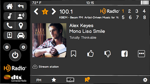
This is the wireframe for a Now Playing Screen for an FM radio station with 8 HD Radio programs. (In practice, most stations only have 2-4 HD Radio programs.) The new features introduced with HD Radio's Connected Radio services includes the ability to Like and Dislike a program with the feedback sent back to the station, and a bookmarking feature. The driver can bookmark favorite songs, and the HMI will monitor live radio broadcasts for whenever they're playing anywhere on the dial. In addition, the driver can opt to stream a station at any time, which would be especially useful when on long roadtrips outside of the broadcast market.
Built into the wireframe is a virtual console on the left mimicking a car's physical center console with dedicated hard key buttons, also of my design. I wanted to illustrate some alternative ways for organizing features in an infotainment system with paired hard key buttons, as well as serving as a branding platform by showcasing the HD Radio and DTS logos.
As noted above, this design is OEM-neutral, which means it doesn't look too much like any one automotive brand's infotainment system. We wanted a design that wouldn't alienate or offend any partners by looking too much like one of their competitors.
Now Playing Screen with HD Radio Features: Screen Mockup
After a concepting phase offering 3 different visual design directions, we ultimately settled on this design direction. As is commonplace in the industry, the dark theme is easier on the driver's eyes, especially at night. It features big buttons, easier to hit within a moving vehicle -- or while standing next to a demo hardware unit in a conference room. For branding purposes, we used "HD Radio Orange" as the primary accent color.
This screen mockup represents a fully realized screen for the production demo app. I wrote the UX requirements and collaborated with the HD Radio technical writers on wording for the corresponding technical requirements documentation. The visual designer created a style guide and sliced media based on this screen. The software programmers did a great at executing this design, too.
Notice the artist shown on screen: Alex Keyes. This was one of a large number of "Faux Artists" that my team created for the purposes of speeding up design concepting while avoiding copyright issues with real people and content. Using a stock image, I asked the visual designer to create album art for each artist. I also gave each artist a list of songs, which made it easier to show mockups of album lists. Where possible, we found an image that could be a still from a faux music video, which would be used in concepts for apps that could play music videos with enhanced DTS audio processing, of course.
Now Playing Screen with DAB Features: Screen Mockup
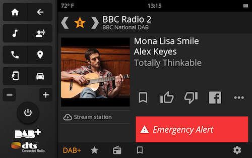
DAB is the digital radio standard for much of Europe and a competitor to HD Radio. However, as a turn key solution ready for worldwide deployment, the HD Radio Connected Radio services offers a consistent set of services for enhancing the DAB radio listening experience, as well.
One of my goals for this project was to create a single Now Playing template that could be easily adapted to a large number of music and audio sources. The template adapted very well to the available content elements in a DAB terrestrial radio broadcast, while also integrating Internet-connected Connected Radio services. I designed similar Now Playing Screens for MP3 music playback, Bluetooth Audio, Podcasting, Satellite Radio, and more.
For illustration purposes, this screen mockup shows where we would insert "toast"-style alerts on screen, as well as the visual look & feel for them.
Live Guide: Wireframe
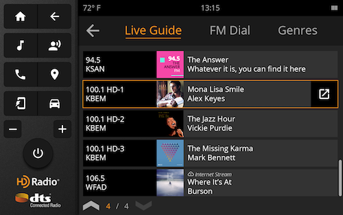
Touching the radio dial-shaped button or "FM" icon at the bottom of the Now Playing Screen displays the Live Guide. This is one of the signature HD Radio Connected Radio features. If a car has 2 or more radio tuners, then it can use one of them to play music, and use another for constantly monitoring what's being played on other radio stations in the area.
I decided to display the Live Guide first rather than the FM Tuner tab for a couple of reasons. For one, it's a signature feature that will be frequently shown off during live demos with automakers and Tier 1 suppliers. In addition, the user goal for browsing what's playing on the radio is more common than tuning to a specific frequency far away on the dial.
Live Guide: Screen Mockup
Here is the screen mockup of the Live Guide. Note that the guide shows a mix of station logos and tag lines, plus artists and songs that are currently playing on the various stations. As now playing info isn't always available for every station, this screen mockup illustrates one strategy for graceful degradation when the current program info isn't available. By contrast, the station logo and tag line should be always available in the US Market, with similar info available in DAB (European) markets.
This screen mockup also illustrates how my team created faux station logos and tag lines in addition to a large library of faux artists, album names and song titles. This helped us avoid alienating any individual radio station partners as well as potential copyright issues.
FM Dial: Screen Mockup
This screen mockup represents my solution for the demo's FM dial needs. The user can drag the bar on the dial to any individual frequency. Available HD Radio stations 1-8 appear above the frequency number, if there are any, along with the logo for branding purposes. The screen features seek and scan functionality, as well as tapping dedicated buttons for going up or down by .2 on the dial. The AM Dial tab has very similar functionality. Additional features that were in an early concept were left out of the current release.
The driver can easily return to the Now Playing Screen by pressing the Music button on the virtual console, or hitting the Back button once.
Audio Sources Screen: Wireframe
Touch the Audio Source button on the Now Playing Screen. I intended for this screen to integrate default apps with audio or music experience apps which the user might install from a proprietary automaker-branded app store. The traditional terrestrial broadcast apps are shown prominently at the top of the first page of the screen.
In an earlier version of this wireframe, the user could swipe to review another set of icons for other audio and music apps.
FM Settings Screen: Screen Mockup
Touch the Settings icon in the bottom right corner of the Now Playing Screen. This screen allows the driver to manage a few FM-specific settings, including providing access to the Connected Radio settings. Connected Radio settings include specifying image size (e.g., high resolution) and controlling the new "station following" experience.
A DTS or HD Radio staff person can also access specific demo settings here, such as setting a location. Whether Las Vegas, Tokyo or Frankfurt, the demo can play AM, FM and HD Radio or DAB stations. It's a cool system.
Workflow for Manually Streaming a Station
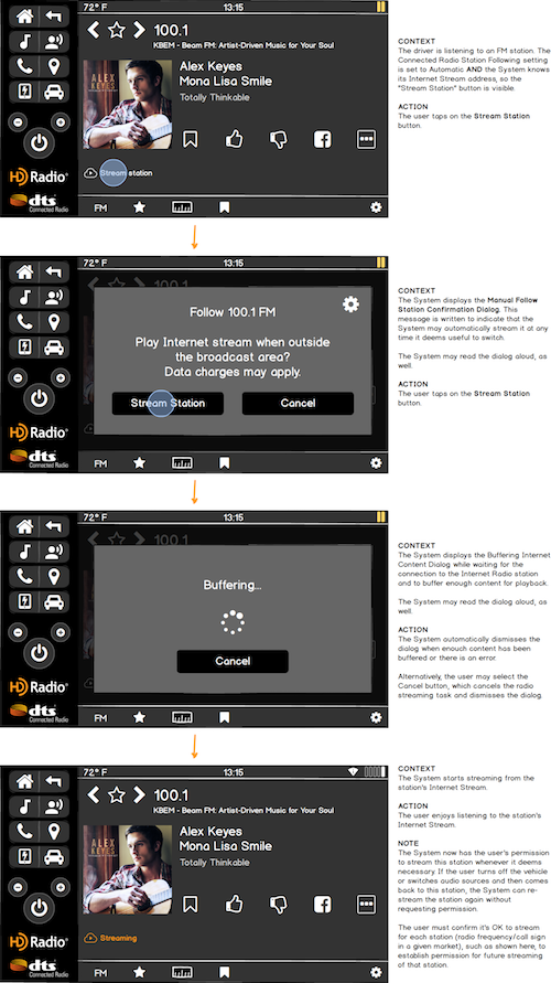
As one might imagine, a brand new Internet-connected platform for what's traditionally been a slow moving technology area, i.e., terrestrial radio, brings with it many complicated new use cases such as this one. As a result, I had to carefully illustrate multiple use cases around the station following features in particular, both the automatic and user-triggered manual cases. Further variations also arise from user settings and HD Radio vs. DAB. One of my strengths is being able to flesh out complicated logic flows such as these.
The Now Playing Screen features a "Stream Station" button, which the user can optionally select at any time. This button should only be displayed when the HD Radio Connected Radio service provides an Internet streaming source URI in the meta-data for the station.


